A shelf can hold all the right things and still look wrong. The problem is rarely the objects themselves — it's the spacing. When every ornament sits the same distance from the edge and every book stands to attention, the eye has nowhere to rest.
Styling display shelves comes down to a few small decisions: what to group, what to leave out, and how much empty shelf to keep. Get those right and a modest collection looks considered. Get them wrong and good pieces look like clutter.
Start with an empty shelf
Before you move a single vase, take everything off. It sounds drastic, and it's the fastest way to see what you're working with: how deep the shelf is, where the light falls, whether it's a focal point or a background detail.
Then decide what the shelf is for. A display run in a living room, an alcove and a kitchen shelf holding everyday crockery all need different treatment. If half the shelf is storage, make that half disciplined — matching boxes, book spines, one run of glassware — and let the rest do the decorative work.
Next, gather more than you need. Bring a dozen candidates together on the floor: ceramics, a framed picture, candlesticks, a bowl, a couple of plants. Swapping pieces on a rug is far easier than reaching over a sofa. Pick two or three materials to repeat across the shelves — wood, ceramic and brass, say, or glass, stone and paper. Repetition is what makes an arrangement look intentional.
Group in odd numbers and vary the heights
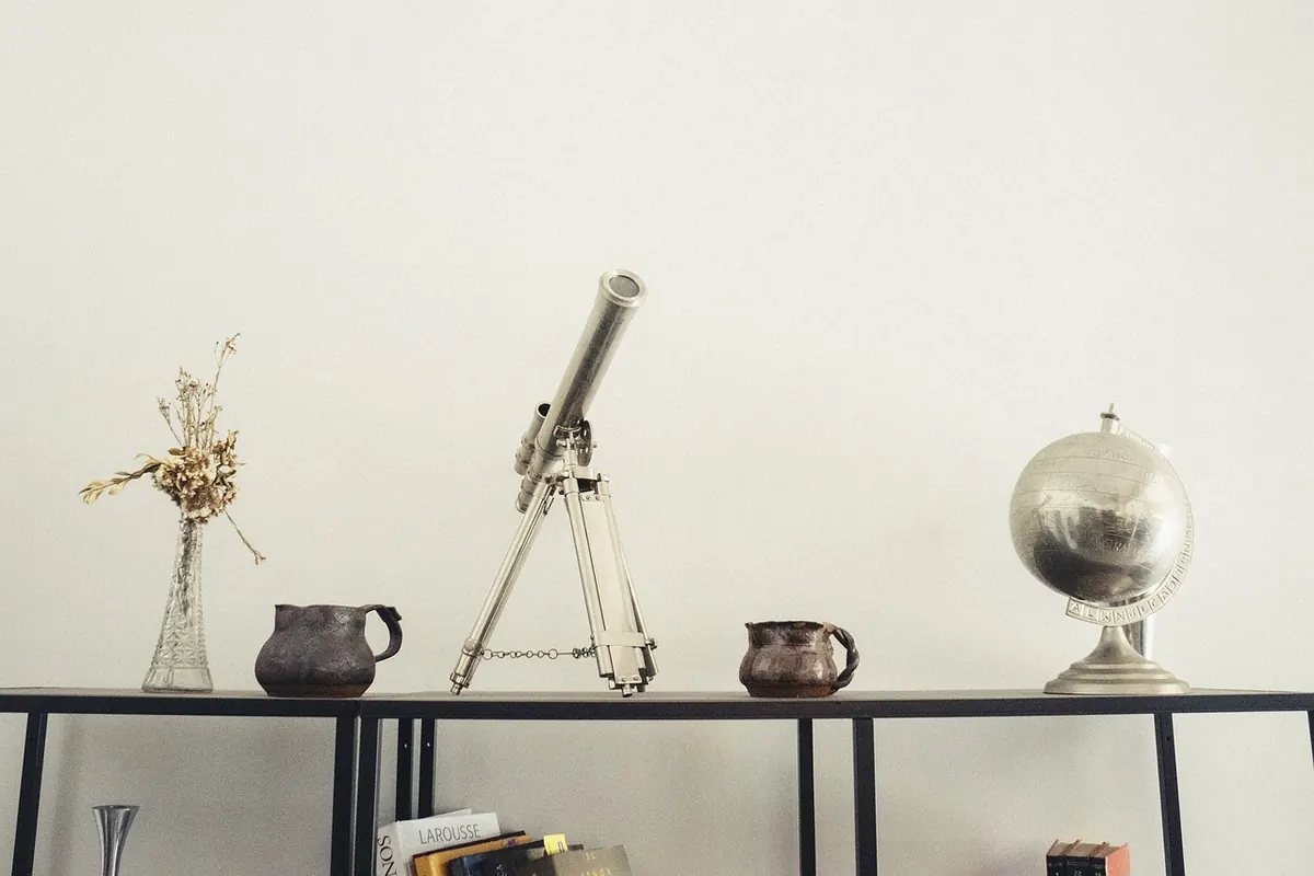
Odd numbers work. Three objects, five, seven — the eye reads them as a composition rather than a pair waiting for a third. Two matching candlesticks either side of a clock looks stiff; one candlestick, a small bowl and a leaning frame looks collected.
Within each group, vary height and shape. A tall stem, a medium bowl and something small and low make a triangle the eye can travel around. If everything is roughly the same size the group flattens, so stack two or three books under the smallest piece to lift it.
A pattern you can repeat
Treat each shelf as having an anchor, a middle and an accent. The anchor is the largest piece: a stack of books, a big vase, a framed print. The middle sits at roughly two-thirds its height. The accent is small and set slightly off-centre. Run that pattern across a whole unit with different objects and it reads as deliberate without looking repetitive.
Let books do the structural work
Books are the most useful styling object you already own. They stack, they come in every colour, and they create height exactly where you need it.
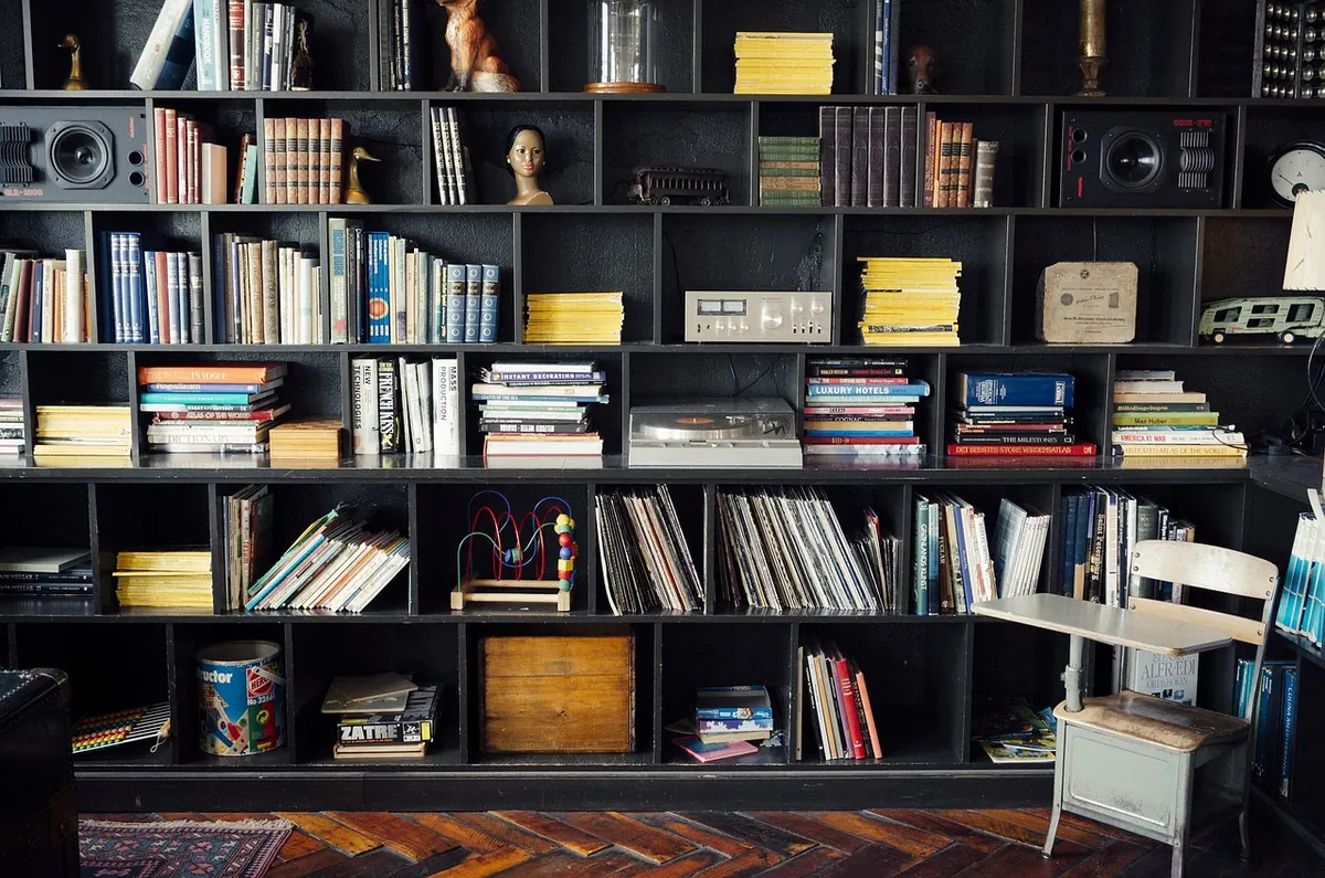
Mix the two orientations. Vertical rows give order and a clean line; horizontal stacks give height and a surface to put something on. Three or four hardbacks with a small object on top will solve almost any awkward gap.
- Keep a vertical run to a shelf's width or less, closed with a bookend or a heavy object.
- Stack in threes, fours or fives. Two looks accidental; six looks like a pile.
- Turn a couple of art books or magazines face out, but only if the covers are genuinely good.
- Match formats to depth: deep shelves take large books, shallow ones need paperbacks.
- Don't feel obliged to arrange by colour. It's striking, but only if you have enough books and can live without finding anything.
Leave more empty space than feels comfortable
Negative space is the biggest difference between a styled shelf and a cluttered one. Aim for roughly a third of each shelf to stay empty — genuinely empty, not partly filled with something small.
Give every group a margin of air. Objects that touch the shelf sides or butt against each other look cramped. Slide a group a few centimetres in from the edge and leave a gap at the end of a run of books. The shelf itself becomes part of the design.
If it looks too sparse, don't fill it straight away. Live with it for a week. Sparse shelves settle in; crowded ones never do.
Build in two layers for depth
Flat arrangements look like a shop display. For depth, think in two layers: a back layer of larger, quieter pieces and a front layer of smaller, more detailed ones. A leaning framed print, a mirror or a large platter sits behind; a small bowl, a candle and a little plant sit in front, overlapping slightly so the two read as one group.
Vary how far forward things sit — some near the back of the shelf, some nearer the front edge — then step across the room and check. Pale objects read well against a dark wall, dark objects against a pale one.
Add texture, and something that's alive
All-matte arrangements look flat; all-shiny ones glare under a lamp. Include at least one textural contrast on each shelf: rough ceramic against smooth glass, woven baskets against polished wood, dried stems against paper.
A plant lifts a shelf more than any ornament. Trailers such as devil's ivy work on upper shelves; small ferns and succulents suit lower ones. Check the light before you buy — a shelf in a dark alcove will kill most plants, and a fake one rarely convinces at close range. Where the light is poor, use dried stems or a bowl of stones instead. Water carefully and stand pots on a saucer; a shelf warped by a leak is nobody's idea of good styling.
Edit, then live with it
When the shelf is finished, photograph it on your phone. Framing it that way reveals what you've stopped noticing: the object that's slightly too big, two pieces at the same height side by side, the gap that isn't quite a gap. Then take one thing away. Almost always the shelf improves, and the piece you remove can go into a box to rotate back in a few months — heavier, darker things in winter, pale ceramics and fresh green in summer.
A fortnightly dust and a rinse of the plant pots does more for a display shelf than any amount of rearranging. And if you're putting up new shelves for anything heavy, fix them into a solid wall or a stud using fixings rated for the weight; ask a qualified joiner if you're unsure.
Photo: JayMantri / Pixabay